
Website Design Trust Signals: How Layout and Copy Reduce Bounce Rate
Last updated: August 23, 2026 · By Joseph Olivas, Founder, MEAN Consultors · 9 min read
Most bounce-rate advice starts with page speed, and speed matters — but I’ve audited plenty of fast sites that still hemorrhage visitors. The pattern I see over and over is the same: the page loads quickly and then fails to earn trust in the first few seconds. In this article I’ll break down how layout and copy function as trust signals, what the research says about how quickly visitors judge you, and the specific design decisions that keep people on the page long enough to convert.
Why Visitors Really Bounce: The Trust Deficit
A bounce is rarely a considered decision. Nielsen Norman Group’s well-known analysis of page-visit durations found that the probability of a user leaving is highest in the first 10 seconds and follows a negative Weibull distribution — meaning if a page survives that initial window, visitors start reading in earnest and are far more likely to stay. Those first seconds aren’t spent reading your feature list. They’re spent answering three subconscious questions: Am I in the right place? Does this look legitimate? Is there an obvious next step?
Layout and copy are how you answer those questions. Stanford’s Web Credibility Research project — still the most cited body of work on the topic — found that people assess a site’s credibility largely from surface cues: visual design quality, how easy it is to verify claims, whether a real organization with real people stands behind the site, and how professional and error-free the writing is. When we rebuild sites through our web development service, trust-signal placement is a design requirement from the first wireframe, not a polish item at the end.
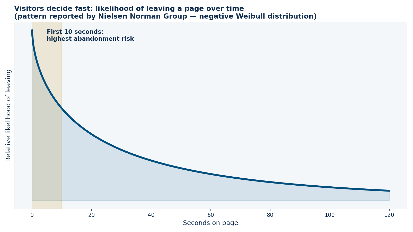
Figure 1: The abandonment risk curve. Survive the first 10 seconds and visitors settle in to read — which is why trust signals must appear immediately, not further down the page.
Layout as a Trust Signal: What Goes Where
Layout is a hierarchy of attention. Visitors scan in predictable patterns, and whatever occupies the first screen carries a disproportionate share of the trust burden. Here’s how I structure that hierarchy on client projects:
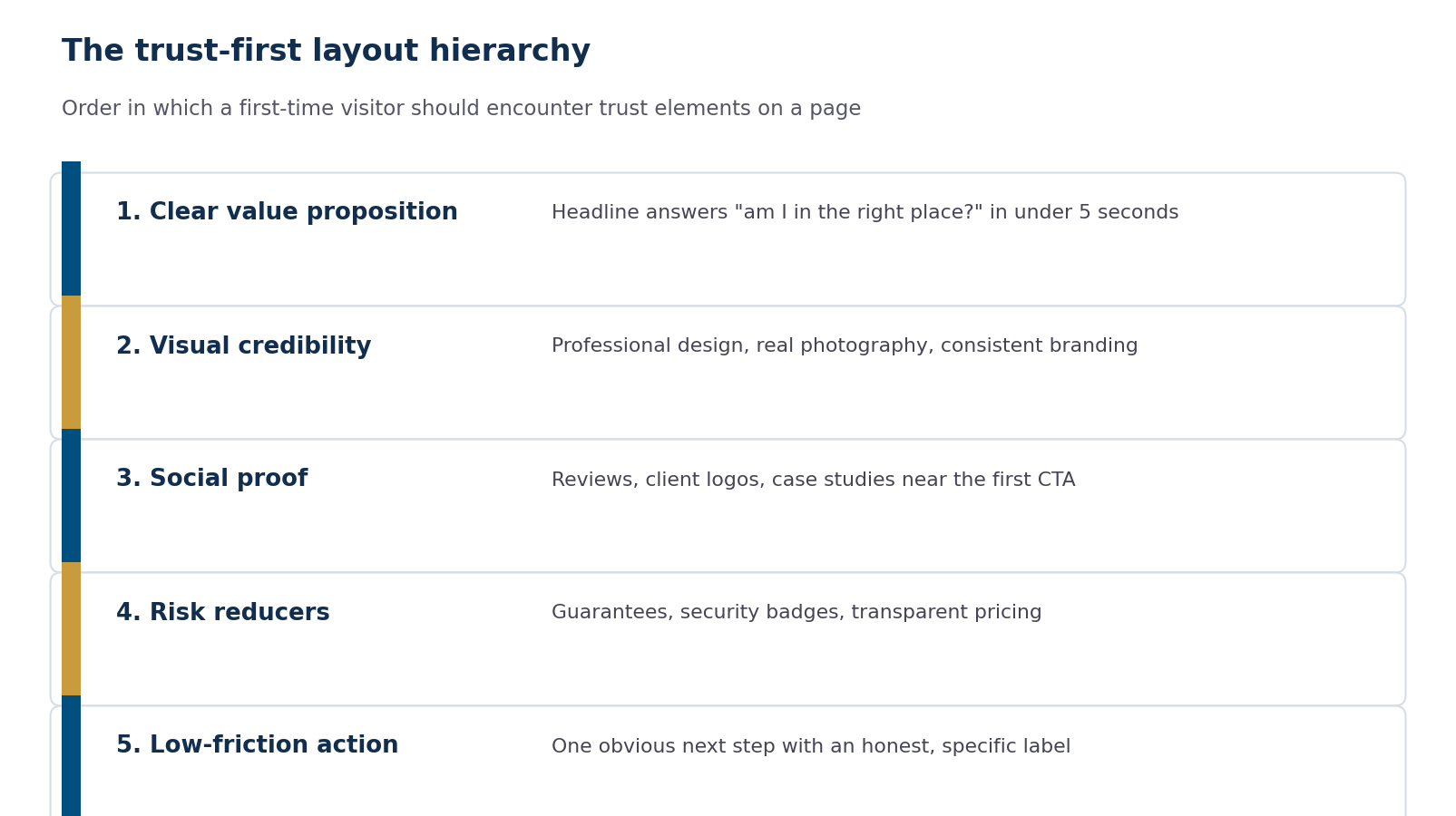
Figure 2: The trust-first layout hierarchy — the order in which a first-time visitor should encounter trust elements on a page.
The value proposition comes first because confusion is indistinguishable from illegitimacy. If a visitor can’t tell what you do within one headline and one subhead, the polish of everything below it is irrelevant. I covered what belongs on that first screen in detail in my guide to above-the-fold design, but the short version is: name the outcome, name the audience, and show one obvious action.
Social proof placement matters as much as its existence. A testimonial buried on a separate “Reviews” page does almost nothing; the same testimonial placed adjacent to your primary call to action answers the doubt at the exact moment it forms. Client logos, review stars, case-study numbers, and certifications all work the same way — they’re objection handlers, and they belong next to the decision point.
- Abandonment risk peaks in the first 10 seconds of a visit, so trust elements must live on the first screen, not below the fold.
- Stanford’s credibility research shows visitors judge legitimacy from surface cues: design quality, verifiable claims, real people, and error-free writing.
- Social proof works as an objection handler — place it adjacent to calls to action, not on a separate page.
Copy as a Trust Signal: Say Less, Prove More
Copy earns or destroys trust sentence by sentence. The most common copy mistake I see on business sites is what I’d call unverifiable superlatives: “industry-leading,” “best-in-class,” “world-class support.” These phrases don’t just fail to persuade — they actively signal that you have nothing concrete to say. Specificity is the antidote. “We answer support tickets in under 4 business hours” is believable precisely because it’s checkable and because it commits you to something.
A useful rewrite exercise: take every claim on your homepage and ask whether a skeptical stranger could verify it. If not, either add the proof (a number, a name, a screenshot, a case study) or cut the claim. This maps directly to Stanford’s finding that ease of verification is a core credibility driver.
| Trust-eroding copy | Trust-building rewrite | Why it works |
|---|---|---|
| “Industry-leading solutions” | “We build order-management systems for distributors doing $2M–$50M in revenue” | Specific audience and scope — verifiable positioning |
| “Trusted by many businesses” | “47 active client sites, average engagement 3+ years” | Numbers invite belief; vagueness invites doubt |
| “Contact us to learn more” | “Get a fixed quote within 2 business days” | Commits to a concrete outcome and timeframe |
| “World-class support” | “Direct line to the developer who built your site” | Describes a mechanism, not an adjective |
Microcopy — the small text on buttons, forms, and error states — carries outsized trust weight because it appears at moments of commitment. A button that says “Get My Free Estimate” outperforms “Submit” not because of persuasion tricks but because it restates the promise at the moment of highest hesitation. Form fields that explain why you’re asking (“Phone — only used to schedule your call”) reduce abandonment for the same reason.
Visual Credibility: Consistency, Security, and Professional Polish
Visual trust is mostly about the absence of red flags. Inconsistent fonts, stretched images, stock photos of handshakes, broken layouts on mobile, and mixed-content warnings each individually seem minor; together they compound into a gut feeling of “something’s off.” Google’s page experience documentation makes a related point from the search side: secure connections, mobile usability, and stable layouts are baseline expectations, not differentiators.
Security indicators deserve special mention because they’re binary trust signals — HTTPS, a valid certificate, and recognizable payment badges either exist or they don’t, and their absence is disqualifying for many visitors. I went deeper on this in SSL, HTTPS, and trust signals, which pairs well with this article: that one covers the technical trust layer, this one covers the design and copy layer.
Here’s the pre-launch trust checklist we run on every build:
- Value proposition readable in under 5 seconds on a phone-sized viewport
- At least one form of social proof visible on the first screen or immediately after
- Real photography or custom graphics — no generic stock imagery in hero positions
- Every claim on the homepage either quantified or backed by a named example
- Contact information, physical location, and a real person findable within one click
- HTTPS everywhere, no mixed-content warnings, visible security cues at any payment or form step
- Buttons labeled with outcomes (“Get My Quote”) rather than mechanics (“Submit”)
- Zero spelling or grammar errors — Stanford’s research flags these as direct credibility killers
Measuring Whether It’s Working
Bounce rate alone is a blunt instrument — a visitor who reads your entire article and leaves satisfied still counts as a bounce in most configurations. Pair it with engagement rate, average engagement time, and scroll depth in GA4, segmented by landing page and traffic source. The diagnostic pattern to look for: pages with high traffic, low engagement time, and low scroll depth are your trust-deficit pages. Fix those first, in traffic order.
When we run this process on client sites, the changes are usually unglamorous — rewriting a headline, moving testimonials up, replacing a stock hero image, adding a specific guarantee — and the compounding effect on engagement is consistently larger than any single “redesign” flourish. Trust is cumulative, and so is distrust.
Frequently Asked Questions
What are website trust signals?
Trust signals are the visible cues visitors use to judge whether a website is legitimate and safe to do business with. They include design elements (professional layout, HTTPS, consistent branding), social proof (reviews, client logos, case studies), transparency markers (real contact information, team photos, physical address), and copy qualities (specific verifiable claims, error-free writing).
How fast do visitors decide to leave a website?
Very fast. Nielsen Norman Group’s analysis of page-visit data found the likelihood of leaving is highest during the first 10 seconds of a visit. Pages that communicate a clear value proposition within that window retain visitors at dramatically higher rates, which is why trust elements need to appear on the first screen.
Does bounce rate directly affect Google rankings?
Google has said bounce rate is not a direct ranking factor. However, the underlying behaviors — visitors returning to search results quickly, low engagement — correlate with pages that underperform in search over time, and Google’s page experience guidance rewards the same qualities (speed, security, usability) that reduce bounces. Treat bounce reduction as a conversion goal that also supports SEO indirectly.
Where should testimonials go on a page?
Adjacent to the decision point they support. A testimonial about easy onboarding belongs next to your signup call to action; a testimonial about results belongs next to pricing. Testimonials isolated on a dedicated page are read by a small fraction of visitors and do far less work.
What’s the single highest-impact trust fix for most sites?
Rewriting the above-the-fold headline from a vague slogan to a specific statement of what you do, for whom, with one concrete proof point. It’s the first thing every visitor reads, it costs nothing to change, and in our client work it moves engagement metrics more reliably than any visual redesign.
Do stock photos really hurt trust?
Generic ones do — visitors recognize staged stock imagery instantly, and it signals that you had nothing real to show. Real photos of your team, office, product, or work consistently outperform stock in credibility research. If real photography isn’t feasible, purposeful custom graphics beat generic stock.
MEAN Consultors builds and redesigns websites where trust-signal placement, copy, and performance are engineered together — so visitors stay, read, and convert.