
Conversion-Centered Design: 10 UX Principles That Increase Leads
Last updated: August 19, 2026 · By Joseph Olivas, Founder, MEAN Consultors · 9 min read
Most of the websites I get called in to fix are not ugly. They are unfocused. The design is clean, the photography is decent, the copy is inoffensive — and the page asks the visitor to do six things at once, so they do none of them. That is a conversion problem dressed up as a design problem, and it is the single most common reason a site with respectable traffic still produces almost no enquiries.
Conversion-centered design is the discipline that fixes it. Below are the ten principles I score every page against, in the order of weight they carry in our audits, plus how to actually apply each one.
What conversion-centered design actually means
The definition is narrower than most people assume. Conversion-centered design is not “design that looks persuasive.” It is a sequencing decision: you choose the one action you want a visitor to take on this page, and then every layout, copy and performance decision is judged by whether it makes that action easier or harder. Everything that does neither is a candidate for deletion.
That sequencing is what separates it from generic custom web development work, where the brief is often “rebuild the site, make it modern.” A modern site that still buries its call to action under three feature grids will not produce more leads than the old one. The structure has to change, not just the styling.
It is also why conversion-centered design pays off across page types, not just landing pages. Service pages, pricing pages, case study pages and checkout steps all have a single next action they are meant to drive. Once you name that action explicitly, the rest of the page starts to arrange itself.
The 10 conversion-centered design principles, ranked by weight
We score pages out of 100 in a conversion audit, and the ten principles do not carry equal weight. A page that fails on focus and message match cannot be rescued by better button colours, so the scoring reflects that reality.

Figure 1: How we weight the ten conversion-centered design principles in a 100-point page audit.
| Principle | Weight | The failure it prevents |
|---|---|---|
| 1. One page, one conversion goal | 15 | Split attention between competing calls to action |
| 2. Message match with the traffic source | 13 | Visitor bounces because the page answers a different question |
| 3. Above-the-fold clarity | 12 | Who you are, what you do and what happens next is unclear |
| 4. Form friction and field count | 11 | Interested visitors abandon at the form |
| 5. Visual hierarchy and directional cues | 10 | Everything looks equally important, so nothing is |
| 6. Trust and risk-reversal signals | 10 | Visitor is convinced but not reassured |
| 7. Mobile thumb-zone ergonomics | 9 | The primary action is hard to reach or hard to tap |
| 8. Load performance at the decision point | 8 | Interaction lag at the exact moment of commitment |
| 9. Accessible contrast, labels and focus states | 7 | Errors and inputs that some visitors cannot read or operate |
| 10. Confirmation and post-submit follow-through | 5 | Momentum dies after the form is sent |
1. One page, one conversion goal
If a page asks a visitor to request a quote, download a guide, subscribe to a newsletter and follow you on LinkedIn, it has no goal. Pick the action that matters commercially, make it the only thing styled as a primary button, and demote everything else to a text link or move it to another page. When a stakeholder insists on two equally important goals, the honest answer is that you need two pages.
2. Message match with the traffic source
The headline on the page should repeat the promise that got the click. If the ad or search result said “same-day emergency HVAC repair in Jacksonville” and the page headline says “Comfort solutions for every home,” you have broken the match, and the visitor now has to work out whether they are in the right place. Match the vocabulary of the source, not your internal brand language.
3. Above-the-fold clarity: who, what, next
In the first screen, a visitor should be able to answer three questions: what is this, is it for me, and what do I do next. Nielsen Norman Group’s long-running eye-tracking research found that people scan pages in an F-shaped pattern rather than reading them, which means the left edge of your first two lines is doing most of the work. Put the specific claim there, not a decorative tagline.
4. Form friction and field count
Every required field is a small negotiation. Ask for what you need to have the next conversation and nothing else — typically a name, one contact method, and a short description of the need. Job title, company size and budget range can be collected later, once the person has already committed. The dominant reason people abandon checkout and enquiry flows is friction rather than lack of interest; Baymard Institute’s aggregate research puts the average ecommerce cart abandonment rate at roughly 70%, with checkout complexity a consistent contributor.
5. Visual hierarchy and directional cues
Hierarchy is the cheapest conversion tool you own. Size, weight, colour, whitespace and position tell the visitor what to look at in what order. Directional cues — an image where the subject is looking toward the form, a line that leads into the button, generous whitespace isolating the call to action — do the rest. If a screenshot of your page squinted at from six feet away does not make the primary button obvious, the hierarchy has failed.
6. Trust and risk-reversal signals
Persuasion gets a visitor interested; reassurance gets them to act. Place the trust signals next to the decision, not on a separate “About” page: a named client outcome, a licence or certification number, a clear statement of what happens after they submit, a plain-language note that you will not spam them. Risk reversal is simply naming the thing they are quietly worried about and answering it.
7. Mobile thumb-zone ergonomics
Most enquiry traffic is now mobile, and mobile abandonment runs higher than desktop across nearly every dataset. Primary actions belong in the comfortable reach of a thumb, tap targets need real padding, and a sticky call-to-action bar often earns its place. Test on an actual mid-range phone on a real network, not only in a desktop browser at a narrow width.
8. Load performance at the decision point
Speed matters everywhere, but it is decisive at the point of commitment. A hero image that arrives half a second late is cosmetic; a form submit that hangs, or a checkout step that blocks on a third-party script, is a lost lead. Google treats page experience signals including Core Web Vitals as part of how it assesses pages, which means the same work pays twice. We cover the measurement side in detail in our guide to page speed and conversion rate.
9. Accessible contrast, labels and focus states
The WCAG 2.1 minimum contrast requirement of 4.5:1 for normal text exists because low-contrast text is hard for everyone to read, not only for people with low vision. The same goes for visible labels instead of placeholder-only fields, error messages tied to the field they describe, and a keyboard focus ring you can actually see. These are accessibility requirements that happen to be conversion improvements — more on the compliance side in our ADA and WCAG website compliance guide.
10. Confirmation and post-submit follow-through
The lowest-weight principle is also the most neglected. A blank “Thank you” page throws away the most engaged moment you will ever get from that visitor. Confirm what happens next and when, give them one useful thing to do while they wait, and make sure the internal notification actually reaches a human quickly. A fast first response is a conversion feature, not an operations detail.
- Focus and message match carry 28 of the 100 points in our audit model — more than hierarchy, trust signals and performance combined.
- Baymard Institute’s aggregate research puts average cart abandonment near 70%, and checkout and form friction is a consistent driver, which is why field count outranks styling.
- Accessibility fixes such as 4.5:1 contrast and visible labels usually improve completion rates for everyone, not only for assistive-technology users.
How to apply this to a page that already exists
Rebuilding from scratch is rarely necessary. The sequence below is the one we run on live pages, and the order matters: baselining before changing anything is what lets you tell a real improvement from a good week.
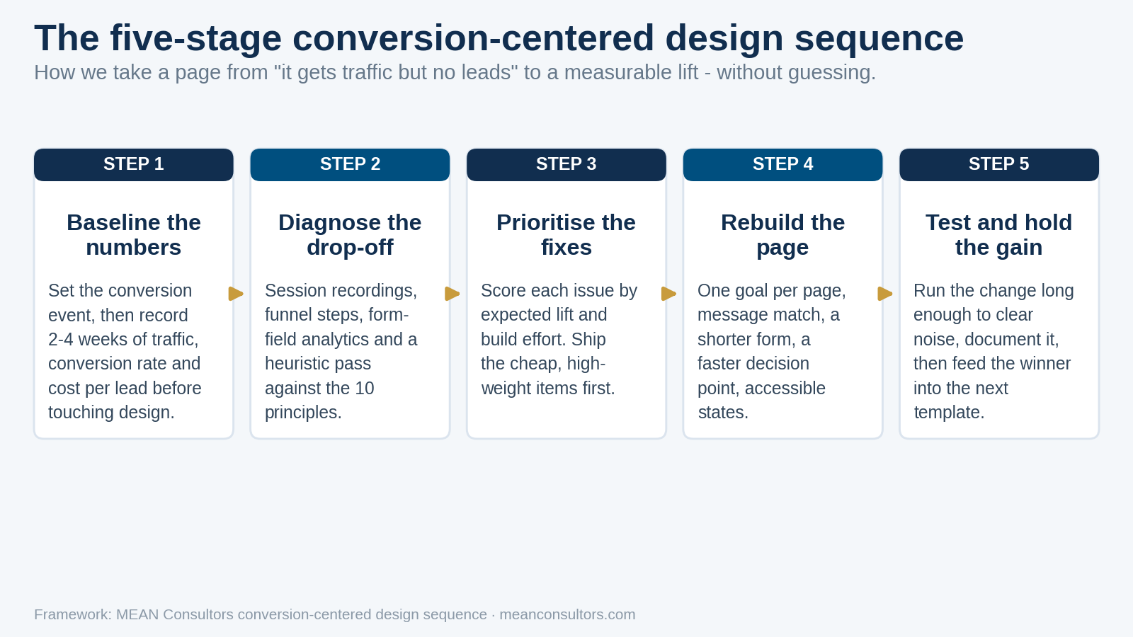
Figure 2: The five-stage sequence we use to take a page from traffic-but-no-leads to a measurable lift.
- Define the single conversion event and confirm it is tracked correctly before you touch design.
- Record two to four weeks of baseline traffic, conversion rate and cost per lead.
- Watch session recordings and form-field analytics to find the actual drop-off point.
- Score the page against the ten principles and list every failure.
- Sort the failures by weight divided by build effort, then ship the top three.
- Leave the change in place long enough to clear weekly noise before judging it.
- Document what worked and push the winning pattern into your page templates.
Four failure patterns worth naming
Designing for the stakeholder review, not the visitor. Pages get cluttered because every internal team wants their section above the fold. The fix is a written conversion goal that everyone signs off on before design starts, so “does this help the goal?” becomes a factual question rather than a matter of taste.
Treating the form as the last five minutes of the project. The form is the conversion. It deserves as much design attention as the hero section, including its error states, its mobile behaviour and what happens after submit.
Optimising a page that the wrong traffic is landing on. If your enquiry page converts poorly because visitors arrive with the wrong intent, the problem is upstream in targeting or in the search terms you rank for. Our SEO services and design work usually need to move together for this reason.
Copying a competitor’s layout. You can see their design; you cannot see their conversion data. That layout may be the losing variant of a test they are still running.
Frequently Asked Questions
What is conversion-centered design?
Conversion-centered design is a page design approach that starts with one measurable conversion goal and removes everything that competes with it. Instead of designing a page and then adding a form, you decide the single action you want a visitor to take, then use hierarchy, copy, layout and performance to make that action the path of least resistance. It applies to landing pages, service pages, pricing pages and checkout flows alike.
How many conversion goals should a landing page have?
One. A page with two competing calls to action splits attention and usually underperforms two separate pages, each with a single goal. Secondary actions are fine as long as they are visually subordinate and do not appear in the same prominence tier as the primary button. If you truly need two goals, that is a signal you need two pages.
How many fields should a lead form have?
Ask only for what you need to run the next conversation. For most business-to-business service enquiries that is a name, an email or phone number, and one free-text field describing the need. Every extra required field is a chance to abandon. If sales needs more detail, collect it on a second step after the visitor has already committed, or in the qualification call itself.
Does page speed really affect conversion rate?
It affects it most at the decision point. A homepage that loads in four seconds is annoying; a checkout step or form submit that hangs for four seconds costs you the lead outright. Google treats page experience signals, including Core Web Vitals, as part of how it evaluates pages, and slow interaction responses are the version of slowness that correlates most directly with abandonment.
How long should I run a conversion test before trusting the result?
Long enough to cover a full business cycle and enough conversions to clear normal week-to-week noise. For most small and mid-size businesses that means at least two to four weeks, not three days. If your page produces fewer than roughly 20 to 30 conversions a month, formal A/B testing will rarely reach significance, so make well-reasoned changes based on principles and measure the trend over a quarter instead.
Is conversion-centered design the same as conversion rate optimization?
They overlap but they are not identical. Conversion rate optimization is the ongoing measurement-and-testing discipline. Conversion-centered design is the design philosophy you apply when building or rebuilding the page, so that your starting point is already sound. Doing the design work first means your optimization programme spends its time on refinement rather than on fixing structural mistakes.
Do accessibility fixes help conversions?
Frequently, yes, because most accessibility failures are also usability failures. Low-contrast text, missing form labels, unlabelled error states and invisible keyboard focus all make a page harder for everyone to complete, not only for people using assistive technology. Meeting the WCAG contrast and labelling requirements tends to lift form completion as a side effect.
MEAN Consultors designs and builds conversion-centered pages for U.S. businesses — scored, measured, and rebuilt around one goal at a time.