
How to Reduce Cart Abandonment With Better Checkout UX
Last updated: August 5, 2026 · By Joseph Olivas, Founder, MEAN Consultors · 9 min read
Every online store owner has watched it happen in analytics: shoppers add products to the cart, start checkout, and vanish. The instinct is to blame price or traffic quality, but the data says otherwise. Most abandonment happens for reasons the checkout itself creates — surprise costs, forced account creation, long forms, and trust gaps. That’s good news, because it means the fix is within your control. In this guide I’ll walk through the checkout UX changes that consistently recover the most revenue for the e-commerce clients we work with at our web development practice.
Why shoppers actually abandon carts
Baymard Institute, which has run large-scale checkout usability research for over a decade, calculates an average documented cart abandonment rate of roughly 70% across dozens of studies. When they ask U.S. shoppers who abandoned a purchase why they did it, the answers cluster around a handful of checkout-specific problems.
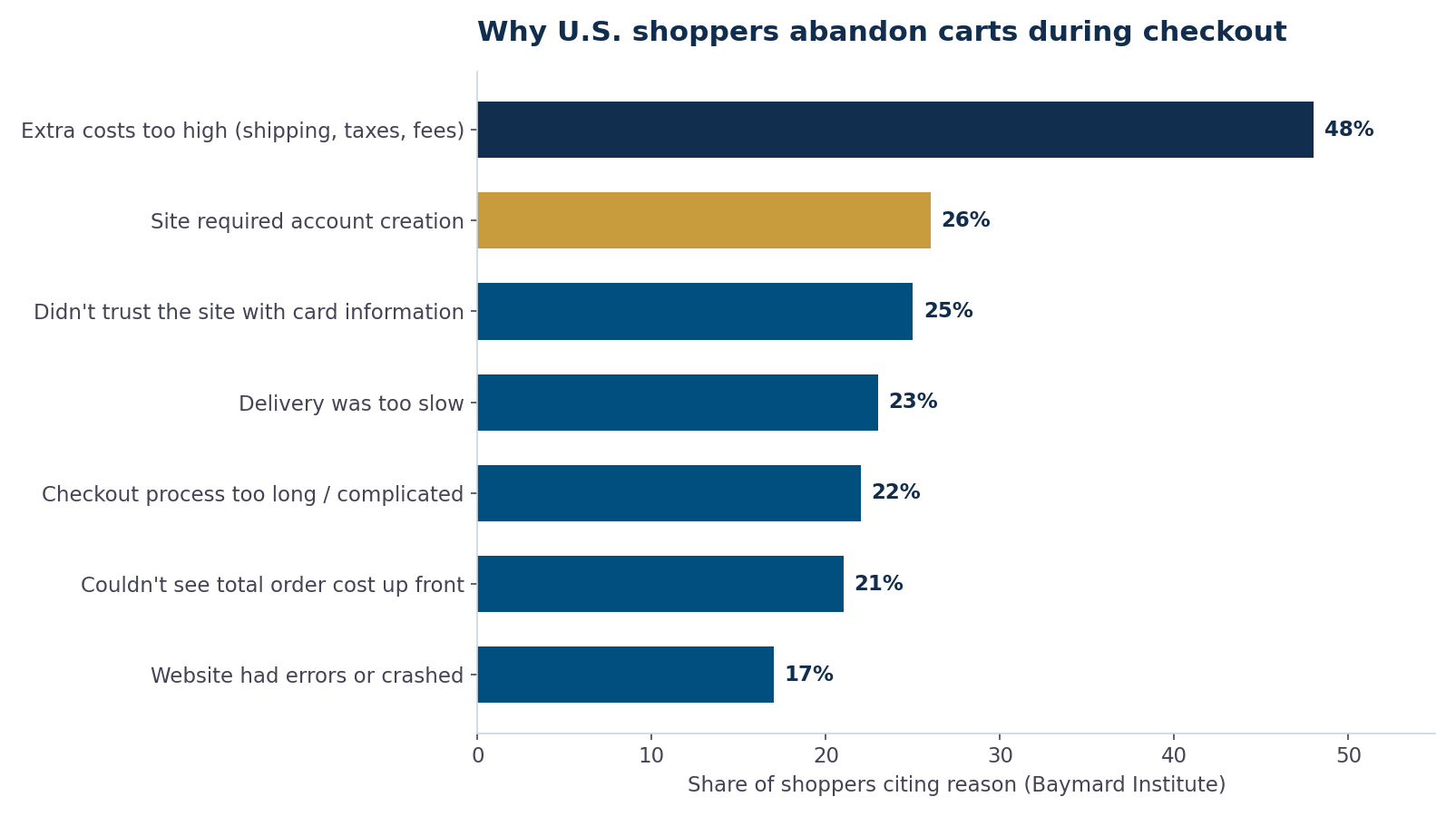
Figure 1: Top checkout-related reasons U.S. shoppers cite for abandoning a purchase, per Baymard Institute survey research.
Notice what leads the list. Extra costs revealed too late — shipping, taxes, and fees — is cited by nearly half of shoppers. Forced account creation, slow delivery, and distrust of the site with card information each drive off roughly a quarter of abandoners. A checkout that’s too long or complicated pushes out about one in five. None of these are pricing problems. They are user experience problems, and every one of them has a design solution.
- The average documented cart abandonment rate is about 70%, so even a few points of recovery translates into meaningful revenue.
- The leading abandonment causes — surprise costs (~48%), forced accounts (~26%), and trust concerns (~25%) — are all fixable checkout UX defects.
- Baymard’s benchmarking shows the average U.S. checkout displays roughly 23.5 form elements, while an optimized flow needs closer to 12.
Fix #1: Show the full cost before checkout starts
The single biggest abandonment driver is sticker shock at the final step. If shipping, taxes, and fees only appear on the last screen, you’ve built a machine for disappointing people at the exact moment they were ready to pay. The remedies are straightforward: display a shipping estimate on the product page or in the mini-cart, calculate taxes as soon as you know a ZIP code, and if you can offer free shipping above a threshold, say so everywhere — it reframes the extra cost as something the shopper controls.
If your platform makes early cost calculation difficult, that’s often a sign of a deeper architectural limitation. We compared how the major platforms handle checkout customization in our guide to Shopify vs. WooCommerce vs. custom e-commerce — the short version is that the more your checkout needs to deviate from platform defaults, the more a custom or headless build earns its keep.
Fix #2: Make guest checkout the default path
Roughly a quarter of abandoning shoppers say they left because the site wanted them to create an account. Account creation is a request for a second transaction — your shopper came to buy a product, and you’re asking them to also start a relationship. Offer guest checkout as the most prominent option, and if you want accounts, ask after the order confirmation, when the shopper has already gotten what they came for. At that point account creation is one field (a password) instead of a gate in front of payment.
Fix #3: Cut the form down to what you actually need
Baymard’s checkout benchmarking finds that the average U.S. checkout flow contains about 23.5 form elements, while a streamlined checkout can get the job done with roughly half that. Every unnecessary field is a small tax on attention, and on mobile it’s a large one.

Figure 2: The average U.S. checkout shows nearly twice the form elements an optimized flow needs, per Baymard Institute benchmarking.
The highest-value cuts we make on client projects:
- Use a single “Full name” field instead of separate first/last name fields.
- Hide “Address line 2” and “Company” behind optional links — most shoppers never need them.
- Default billing address to shipping address with a pre-checked box.
- Use ZIP code lookup to auto-fill city and state instead of asking for both.
- Ask for a phone number only if fulfillment genuinely requires it, and say why.
Fix #4: Build trust and recover from errors gracefully
About one in four abandoners say they didn’t trust the site with their card information. Trust at checkout is mostly visual and contextual: a clean, professional design, recognizable payment logos, an HTTPS padlock, a visible returns policy, and payment options like PayPal, Apple Pay, or Google Pay that let shoppers avoid typing a card number on a site they don’t know yet.
Error handling matters just as much. When validation fails, keep everything the shopper typed, scroll them to the specific field, and explain what to fix in plain language. A checkout that wipes the card form because the ZIP didn’t match is a checkout that just asked a ready-to-pay customer to start over — many won’t.
Fix #5: Treat checkout speed as a conversion feature
Slow pages compound every other problem: a shopper who’s tolerating a long form will not also tolerate a three-second wait between steps. Deloitte and Google’s “Milliseconds Make Millions” study found that a 0.1-second improvement in mobile site speed increased retail conversions by 8.4% and average order value by 9.2%. We’ve covered the mechanics in depth in our posts on page speed and conversion rate and mobile-first performance — checkout pages deserve the strictest performance budget on your entire site.
Prioritizing the fixes: impact vs. effort
Not every store should start in the same place. Here’s how we typically rank the interventions when auditing a client checkout:
| Checkout fix | Abandonment driver addressed | Typical effort | Priority |
|---|---|---|---|
| Show shipping/taxes early | Surprise costs (~48% of abandoners) | Low–medium | 1 — do first |
| Guest checkout by default | Forced account creation (~26%) | Low | 2 |
| Express payment options (Apple Pay, PayPal) | Trust concerns (~25%) | Low–medium | 3 |
| Form field reduction | Long/complicated checkout (~22%) | Medium | 4 |
| Performance budget on checkout pages | Errors, perceived slowness (~17%) | Medium–high | 5 |
Mobile checkout deserves its own audit
Mobile traffic dominates most retail stores, yet mobile checkouts routinely convert at half the desktop rate. The gaps are usually mechanical: input fields that trigger the wrong keyboard (use inputmode="numeric" for card and ZIP fields), tap targets that are too small, and multi-column layouts that break on narrow screens. Autofill support matters enormously — correctly annotated fields let the browser complete most of the form in one tap. If you run your funnel numbers by device and see mobile lagging desktop by more than 30–40%, checkout UX is almost always the culprit.
Frequently Asked Questions
What is a good cart abandonment rate?
Baymard Institute’s average across documented studies is roughly 70%, so anything meaningfully below that is already better than typical. Rates vary by industry and traffic mix — stores with heavy comparison-shopping traffic naturally run higher. Rather than chasing a universal number, benchmark your own rate and work to improve it quarter over quarter.
Does guest checkout really increase conversions?
Yes — forced account creation is the second most-cited reason for abandonment in Baymard’s survey data, at around 26% of abandoners. Offering a prominent guest option removes that objection entirely, and you can still capture accounts by inviting shoppers to save their details after the purchase completes.
How many form fields should a checkout have?
Baymard’s benchmarking shows the average U.S. checkout displays about 23.5 form elements, while an optimized flow needs closer to 12. The practical target: ask only for what fulfillment and payment strictly require, default billing to shipping, and make rarely used fields optional and collapsed.
Do exit-intent popups and discount codes fix cart abandonment?
They can recover some sessions, but they treat the symptom. If shoppers are leaving because of surprise costs or a long form, a 10% coupon trains them to abandon on purpose next time. Fix the structural UX problems first; use recovery emails and incentives as a supplement, not a substitute.
How much does checkout page speed affect abandonment?
Significantly. Deloitte and Google’s “Milliseconds Make Millions” research measured an 8.4% retail conversion lift from just a 0.1-second mobile speed improvement. Slow checkout steps amplify every other friction point, which is why we recommend the tightest performance budget on your site apply to checkout.
Should I rebuild my checkout or optimize the one I have?
Start by optimizing: cost transparency, guest checkout, and field reduction are achievable on most platforms. If your platform blocks those changes — some template systems lock checkout layouts entirely — that constraint is itself the answer, and a custom or headless checkout becomes worth pricing out.
MEAN Consultors audits and rebuilds e-commerce checkouts that convert — from quick UX fixes to fully custom flows.