
Above the Fold Website Design: What Should Be There in 2026 (With Examples)
Last updated: August 21, 2026 · By Joseph Olivas, Founder, MEAN Consultors · 9 min read
Every week I review websites for businesses that can’t figure out why traffic isn’t turning into leads. Nine times out of ten, the first thing I see when the homepage loads is the problem: a vague headline, a rotating carousel, three competing buttons, and no reason to believe. The section a visitor sees before scrolling — “above the fold” — is the most valuable real estate on your entire website, and in this guide I’ll walk through exactly what belongs there in 2026, what doesn’t, and how we approach it in our own web development projects.
Why the Fold Still Matters (Even Though Everyone Scrolls)
You’ll hear that “the fold is dead” because users scroll on every device. It’s true that scrolling is second nature — but attention is not evenly distributed. Nielsen Norman Group’s scroll-and-attention research found that users spend 57% of their page-viewing time above the fold, and 74% of it in the first two screenfuls. People do scroll, but only after the first screenful convinces them the page is worth their time.
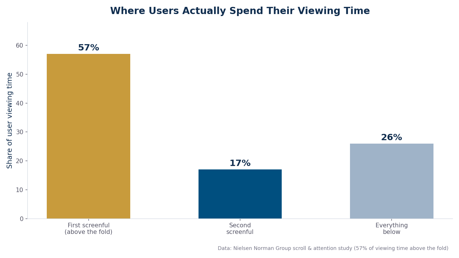
Figure 1: Distribution of user viewing time by screenful, based on Nielsen Norman Group’s scroll and attention research.
That means your above-the-fold section has one job: earn the scroll. It doesn’t need to tell your whole story — it needs to answer three questions in about five seconds: What is this? Who is it for? What do I do next? If a stranger can’t answer those from the first screenful, no amount of beautiful content further down will save the page.
The 5 Elements Every Above-the-Fold Section Needs
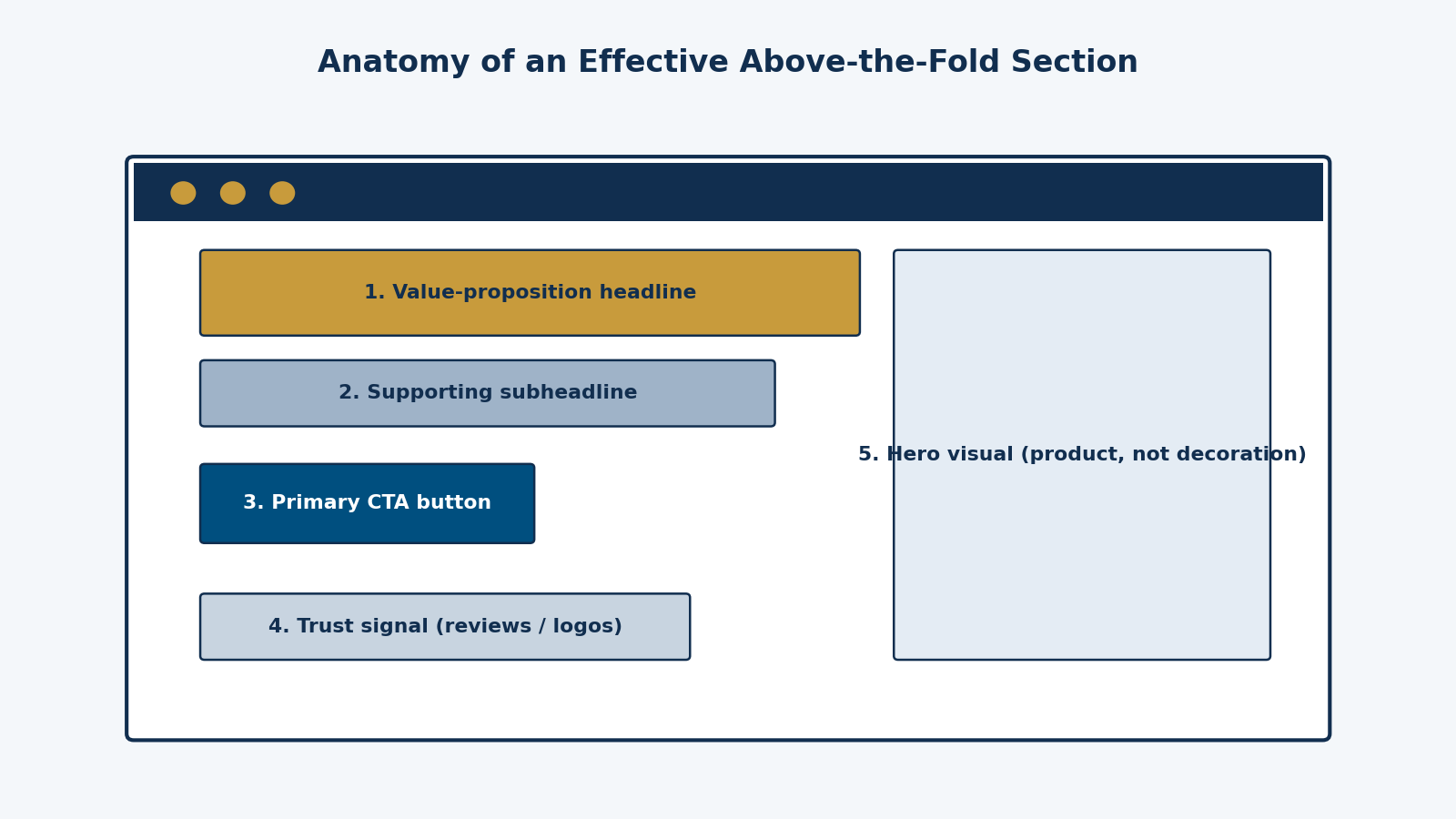
Figure 2: The anatomy of an effective above-the-fold section — five elements, one primary action.
1. A value-proposition headline (not a slogan)
The headline is the single most-read element on the page. It should state the concrete outcome you deliver, for whom. “Innovative solutions for a connected world” tells a visitor nothing. “Custom inventory software for medical equipment distributors” tells them everything. A useful test: if you swapped your headline onto a competitor’s site and it still made sense, it’s too generic.
2. A supporting subheadline
One or two sentences under the headline that add the missing specifics: how you do it, what makes it credible, or what the visitor gets first. This is where you can mention speed, price positioning, or your differentiator without cluttering the headline.
3. One primary call to action
Not three. One visually dominant button with a specific label — “Get a Free Quote,” “See Plans & Pricing,” “Book a 15-Minute Call.” A secondary, lower-emphasis link (“See our work”) is fine, but when two buttons compete at equal weight, both lose. This is a core principle of conversion-centered design: every added choice above the fold dilutes the one that matters.
4. A trust signal
Star ratings, client logos, a review count, a certification badge, or a one-line testimonial. Visitors in 2026 are trained to look for third-party proof before engaging, and placing it above the fold shortens the distance between arrival and belief. One strong signal beats a wall of badges.
5. A hero visual that shows, not decorates
Show the product interface, the finished project, the before-and-after — something that carries information. Generic stock photos of handshakes actively hurt credibility. If you sell software, show the software. If you sell a service, show the deliverable or the result.
- Users spend 57% of viewing time above the fold and 74% in the first two screenfuls (Nielsen Norman Group), so the first screenful carries most of the persuasion load.
- The five required elements are: value-proposition headline, subheadline, one primary CTA, a trust signal, and an informative hero visual.
- The above-the-fold section’s job is not to close the sale — it’s to answer “what, for whom, and what next” in under five seconds and earn the scroll.
What to Remove From Above the Fold in 2026
Just as important as what goes in is what comes out. These are the elements I remove most often when redesigning underperforming pages:
- Auto-rotating carousels. They split your message into slides nobody waits for, and they push real content down. One message, stated well, outperforms five messages on a timer.
- Autoplay video backgrounds. They inflate load time and compete with your headline for attention. If video matters, make it click-to-play below a fast-loading hero.
- Multiple equal-weight CTAs. “Learn More,” “Contact Us,” and “Get Started” side by side force a decision before the visitor has a preference.
- Early popups. An interstitial that fires before the visitor reads your headline interrupts the only five seconds that matter. Google’s guidance on intrusive interstitials also makes this an SEO risk on mobile.
- Vague slogans and jargon. “Empowering synergy through innovation” occupies the most valuable line on your site with zero information.
The Mobile Fold Is the Real Fold
For most of the businesses we work with, 55–70% of sessions are mobile, which means the fold that matters is roughly 360×640 CSS pixels — a fraction of the desktop canvas. On mobile, the sticky header, the headline, one line of subheadline, and the CTA button are often all that fit. That constraint is clarifying: if your message doesn’t survive being cut to a headline and a button, it wasn’t sharp enough to begin with.
Two practical rules follow. First, design the mobile fold first and let desktop inherit the hierarchy — the same philosophy behind mobile-first performance work like our guide to mobile page speed. Second, remember that the fold only exists once the page renders: a hero that takes four seconds to paint has no fold at all, just a blank screen. Google’s Core Web Vitals treat Largest Contentful Paint — usually your hero image or headline — as a primary user-experience metric, so above-the-fold design and performance are the same conversation.
What This Looks Like in Practice: 3 Example Patterns
| Business type | Headline pattern | Hero visual | Primary CTA |
|---|---|---|---|
| B2B service firm | “[Outcome] for [industry] — without [pain point]” | Deliverable or dashboard screenshot | Book a call / Get a quote |
| SaaS / software product | “The [category] that [key differentiator]” | Product UI in a device frame | Start free trial / See demo |
| Local service business | “[Service] in [city], [credibility marker]” | Real team or real project photo | Call now / Request estimate |
Notice what all three patterns share: specificity. The headline names an outcome or a place, the visual carries proof, and the CTA matches the visitor’s natural next step for that business model. The same logic extends down the page — the fold sets up a promise the rest of the layout has to keep, which is why we treat it as part of overall site navigation and browsing behavior, not an isolated banner.
How to Test Your Above-the-Fold Section
Treat the fold as a hypothesis, not a decree. The highest-leverage tests, in the order I run them: headline copy (outcome vs. category framing), CTA label (specific vs. generic), trust signal placement (above vs. below the CTA), and hero visual (product shot vs. lifestyle image). Change one variable at a time and give each test enough traffic to mean something. Scroll-depth analytics will also tell you what percentage of visitors never make it past the first screenful — if that number is high, the fold is failing at its one job of earning the scroll.
Frequently Asked Questions
What does “above the fold” mean in web design?
“Above the fold” is the portion of a web page visible before the user scrolls. The term comes from newspapers, where the top half of the folded front page carried the biggest headlines. On the web, the fold varies by device and screen size, so designers treat it as the first screenful rather than a fixed pixel height.
Where exactly is the fold in 2026?
There is no single fold — it depends on the device. Common reference viewports are roughly 360×640 to 430×932 CSS pixels on phones and 1366×768 to 1920×1080 on desktop. Best practice is to design the first screenful for your most common viewport in analytics, then verify on the smallest one that matters to you.
Does above-the-fold content affect SEO?
Indirectly but meaningfully. Google’s page experience guidance rewards pages whose main content loads quickly and is immediately visible — Largest Contentful Paint usually measures your hero element — and its guidance discourages intrusive interstitials and ad-heavy first screens. A strong fold also reduces immediate bounces, which supports the engagement your rankings ultimately depend on.
Should I put a form above the fold?
For high-intent landing pages (paid search traffic for “emergency plumber,” for example), yes — a short form above the fold usually wins. For homepages and content pages where visitors arrive colder, a button that leads to the form typically outperforms an embedded form, because it doesn’t demand commitment before establishing value.
Is a video background above the fold a good idea?
Usually not. Autoplay video inflates load time, hurts Largest Contentful Paint, and competes with your headline. If video is central to your pitch, use a fast static hero with a click-to-play thumbnail — you keep the persuasion benefit without paying the performance cost.
MEAN Consultors designs conversion-focused websites where the first screenful does its job — clear message, fast load, one obvious next step.